After the 1896 update, Hunt: Showdown has its highest-ever player count. However, player complaints about UI are lowering its Steam review score. 'I've not seen such a bizarre response to so much incredible content'
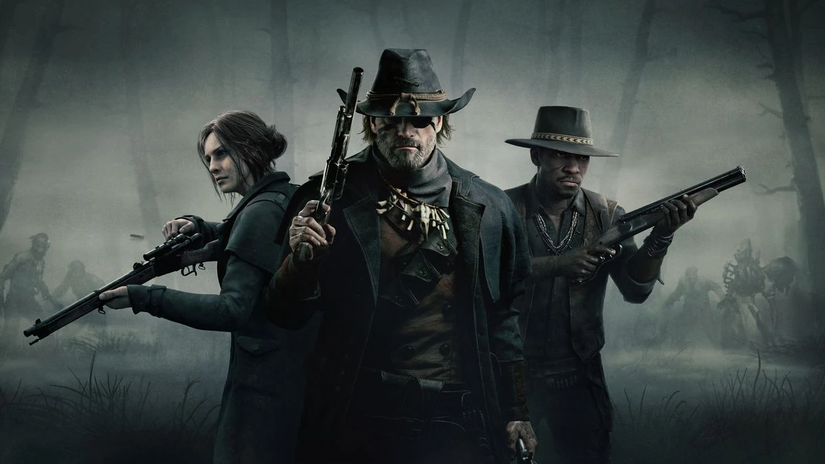
Crytek, the developer of grungy horror-extraction shooter Hunt: Showdown, has just released its biggest update in many years. The developer upgraded its engine, overhauled its UI, added a fourth map named Mammon's Gulch and made other significant tweaks. The game's been renamed Hunt: Showdown 1896, a result of the extensive rework.
Hunt reached a new concurrent player high on the first day: 59.968, 18,000 more than it had in October 2023. At the time of publishing, over 51,000 players are currently in-game, chasing or being immolated the new Hellborn boss.
According to that metric the shooter has never been more popular. The update has also aggravated complaints, with 3,730 negative reviews so far. This has pushed Hunt's label to Mostly Negative in the short term, while its long-term status remains Mostly Positive.
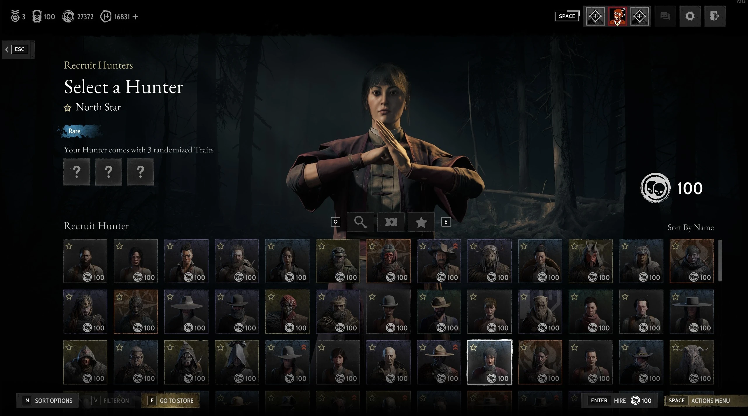
How can Hunt be both more popular than ever, and condemned by a greater number of Steam players than ever before? The main issue is the new pre-match interface, as shown in the embedded video. Many reviewers complain that Crytek made it worse, not better.
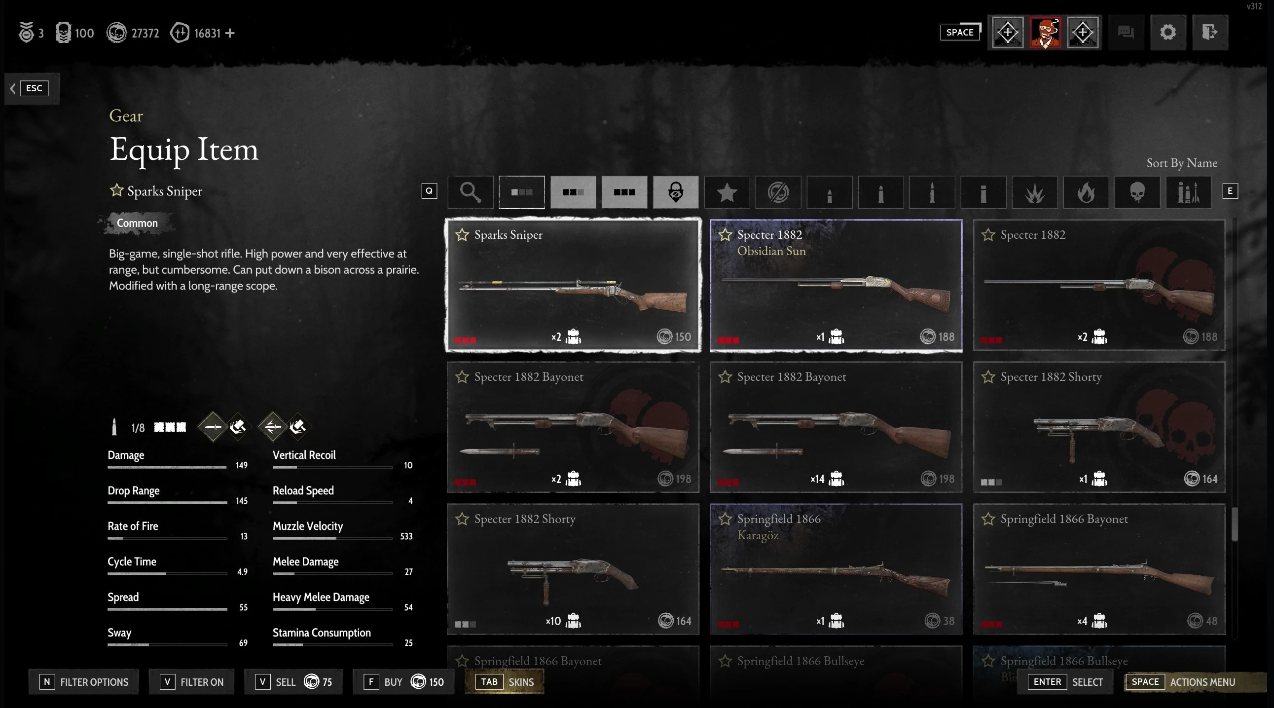
The most common complaint is that the UI requires more clicks than before to accomplish most tasks. Shinigaben, a user, says that the interface is "fancy but difficult to navigate". "You need to click 3 or 4 times more per action than the old UI, and it gives less information on a single screen without switching between submenus."
If you've ever experienced a major UI update on a social media platform such as Facebook or Discord, then you know how the change to a new method of presenting information can often cause a lot of anger. Some Hunt players believe that the more complex interface was designed first for consoles. They also complain about the larger icons and the apparent lack of basic keyboard entries. Hunt was first released on PC (Early Access) in 2018, with Xbox One and PS4 versions coming over a year later in 2019 and 2020. This new version launches simultaneously on PC, PS5 & Xbox Series X/S. It's possible that the UI was retooled to make compromises for all three platforms.
Some claim that Crytek has redesigned the UI in order to bring microtransactions front and center. They compare the new approach with the monetisation methods seen in games such as Call of Duty: Warzone and Fortnite. "The first thing that you see when you load ingame is Crytek selling you skins !!!" Asthmaschildkrote writes, while others claim that the UI forces players to look at Battle Pass. As long-time players of Hunt, this does not resonate with us. Hunt's monetization appears to be the least burdensome and most prominent of its peers.
Players are not only upset with the UI. Some players claim the update has caused more performance issues than it has solved. Sloppy Steaks, a user with a witty name, claims that the update has caused his performance to drop so low that he can no longer play without stuttering. Some of these complaints are about bugs and others claim that the graphics have changed for worse. These issues are raised far less frequently than the UI problems, which seem to be mentioned in almost every recent negative review on Hunt's Steam page.
The frame rate has not changed significantly since last week's update.
The UI definitely has some issues that need further attention. Is the intensity of the reaction justified? Numerous reviews praise the update in general, but give it a thumbs-down because of the user interface. "The new engine update has made my game run much more smoothly. The new map is also really nice. "I like the increased verticality," said user Sir Fluffy MacDuck. "However, this new menu interface is such a pain." Furtive Pygmy, meanwhile compliments Crytek for doing "a wonderful update" but says that the UI is so bad that "I simply do not want to play any more."
Can a Menu UI, (which is not the focus of any of the complaints) be so bad as to ruin the experience of playing the game? Is this yet another example of PC gamers hyper-focusing on a feature of a game they know will resonate with comment threads?
Some players certainly feel that the latter is true. Reddit user Redwood Lynx, who is a "casual father" player, praises Crytek's "incredible map". "There must be some PC cultural quirk that I'm unaware of. Being this angry about MENUS is beyond the understanding of this old timer. Did anyone actually play the game? No one wants to talk about the new weapons, new bosses, new maps, new traits, new balance changes... ANYTHING? No, you want to review-bomb the greatest shooter from the last decade because daddy paid more attention to your little console brother."
As was hinted at in the paragraph above, this is not the first time that a game has been plagued by misdirected anger. Helldivers 2, the most innovative shooter of the past year, has been dominated with discussion over the balance of weapons. Weapon balance can be critical to the quality of a video game. Helldivers 2 isn't a twitchy multiplayer game like Counter-Strike of Valorant. It's a cooperative experience with a Starship Troopers simulation that emphasizes physics-based slapstick humor. Helldivers 2 isn't really about balance.
The new interface is a bit uncomfortable. We experienced this during our hours of playing Hunt's latest update last night. Some old habits now require more input. For example, when you want to add multiple consumables to a hunter, you have to switch between the gear menu screen and the hunter detail screen to add each item of equipment, which is inefficient. Some actions, such as selecting different life bar segments for the hunter, are now a little smoother. We don't deny that some players find these changes jarring. However, the 1896 update is much more than just the UI.
There are obviously bigger fish to fry. What's the deal with that pristine suburb visible on one end of Mammon’s Gulch’s skybox?

Comments